

The cool greys that went into so many Dublin homes over the last ten years are on their way out. In 2026 the colours that hold up best indoors are warmer: soft off-whites with a bit of yellow or pink in them, greige, muted greens and deep blue-greens. This guide goes room by room, explains why Dublin’s light changes which of those you should pick, and covers the sheen and prep decisions that decide whether the finish still looks right in five years.
Start with your light, then pick the colour
Most Dublin houses face a long run of grey, overcast days, and a lot of rooms face north. North light is cool and flat. It pulls the blue out of any colour, so a grey that looked clean on the chart turns cold and dull on a February afternoon. If a room faces north, choose colours with a warm base. South- and west-facing rooms get warmer light through the day and can carry cooler tones without going grey.
Room size matters as well. Victorian and Edwardian terraces in Rathmines, Stoneybatter or Phibsborough tend to have narrow halls and deep back rooms, and plenty of newer semis and apartments have compact bedrooms. Painting a small room brilliant white rarely makes it feel bigger. In weak light, bright white reads as flat grey and shows every shadow in the corners. A warm off-white, or a mid-tone carried across walls, skirting and doors, often makes a small room feel calmer and larger because your eye stops catching on edges.
Before you commit, check the Light Reflectance Value (LRV) on the colour card. A higher LRV bounces more light. For a dark hall, stay at the higher end of the scale.
Warm off-whites and greige
These are the workhorse colours of 2026. A warm off-white keeps a room bright without the hard, clinical look of brilliant white. Greige, the grey-beige middle ground, hides scuffs better than white and sits well with oak floors, brass fittings and the cream or stone sofas found in a lot of Dublin living rooms.
A few practical points:
- Paint ceilings a shade lighter than the walls, or in the same colour at a lower strength, so the join at the coving looks deliberate.
- Look at the undertone in daylight and under your own bulbs. A greige with a green undertone can look muddy under warm LED lighting.
- If you want a white on woodwork, pick one that suits your wall colour. A cold white next to a warm wall makes the wall look dirty.
Deep greens and blues
Sage, olive, bottle green, teal and inky blue have moved from feature walls to whole rooms. They suit period houses with high ceilings, deep skirting and ornate coving, because the white plasterwork stands out against the dark wall. We painted the room below in a deep teal, with the coving, ceiling roses and fireplace surround kept white.
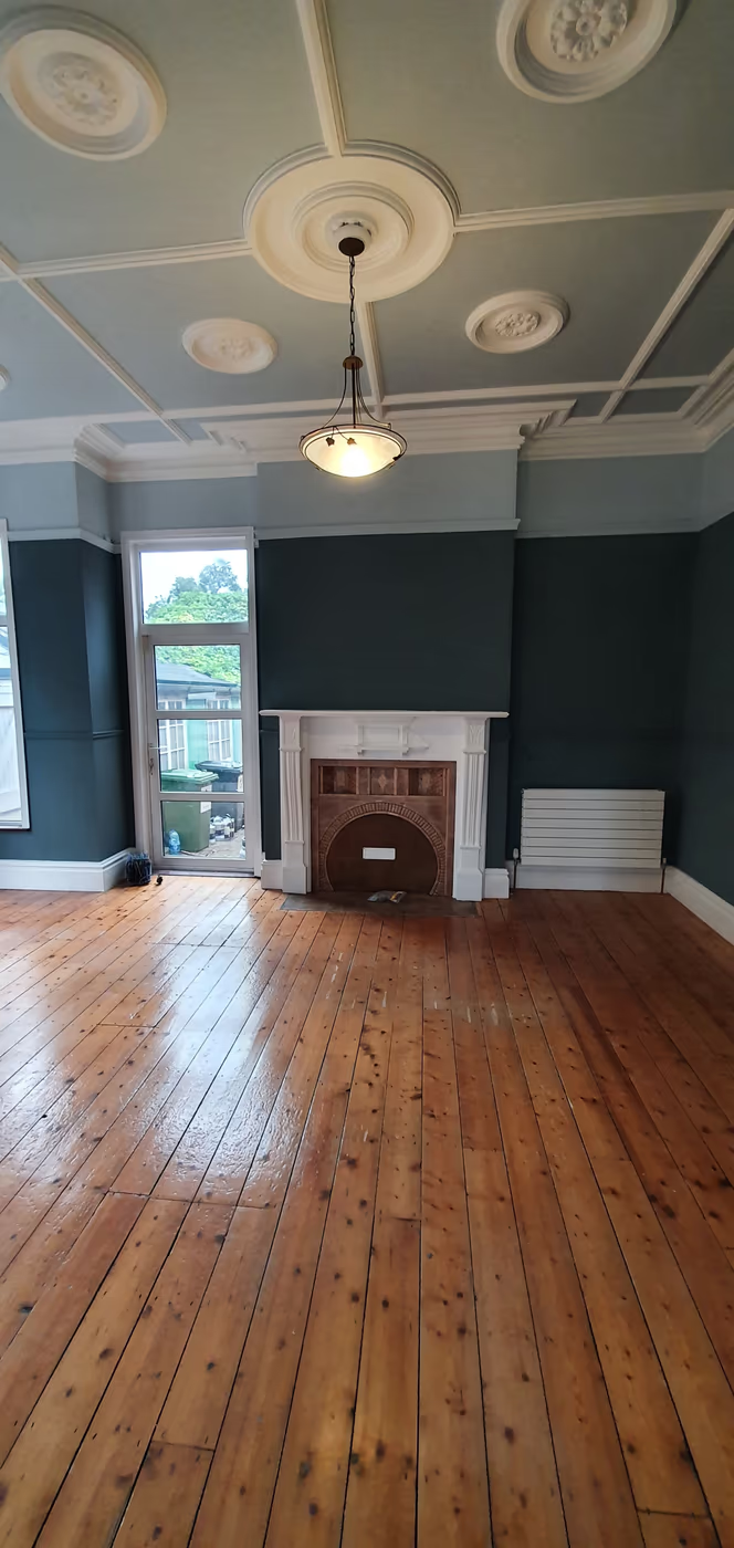
Deep colours ask more of the painter. They usually need an extra coat to reach full depth, and any bump, crack or old roller line shows up under a lamp. Dark matt paint can also mark if you rub against it, so for a hallway or family room pick a durable matt rated for washing.
Room by room
| Room | Colours that work | Wall finish |
|---|---|---|
| Hall, stairs and landing | Warm off-white or greige above, deeper colour below a dado or on the banister | Durable, washable matt |
| Living room | Deep green, teal or blue in period rooms; warm greige in open-plan spaces | Matt |
| Bedroom | Muted sage, soft plaster pink, dusky mauve, warm grey-green | Matt |
| Kitchen walls | Warm white or a pale tone taken from the cabinets | Kitchen and bathroom grade |
| Kids’ rooms | Calm mid-tones with one brighter accent band | Scrubbable matt |
Hall, stairs and landing
Your hall takes more wear than any other part of the house and usually gets the least daylight. Keep the walls light and warm so the space doesn’t close in, and put colour where it works harder: below a dado rail, on the stair stringer, or on the spindles and handrail. Several of our recent stair jobs pair sage-green spindles and handrails with warm white walls. Our hall, stairs and landing painting page covers how we handle the height and access.
Living room
The living room is where a deep colour earns its place, since you use it most in the evening under lamps. Try the colour on the chimney breast first if you’re unsure, or go all in and paint walls, skirting and doors the same shade. In open-plan rooms, a warm greige ties the kitchen and living areas together better than two competing colours.
Bedroom
Bedrooms suit softer, muted tones: grey-greens, plaster pinks and dusky mauves. They look restful in daylight and warm at night. A matt finish helps, as it doesn’t throw back the light from a bedside lamp.
Kitchen walls
If your cabinets carry the colour, let the walls step back. A warm white or a pale version of the cabinet colour works well. Kitchen walls need a paint made for steam and grease, which you can wipe down without polishing the surface. For cabinet colours, see our guide to the 7 finest kitchen cabinet paint colours.
Kids’ rooms
Children’s rooms get repainted every few years, so you don’t need a forever colour. Pick a calm mid-tone for most of the walls and add a brighter band, a painted arch or a coloured door they chose themselves. Use a scrubbable matt so crayon and fingermarks come off.
Matt or eggshell on woodwork?
On walls, matt suits most rooms. It hides the dips and patches common in older Dublin plaster. In halls, kitchens and kids’ rooms, a durable matt gives you the same look with better resistance to washing.
Woodwork is where people hesitate:
- Eggshell has a low sheen and a modern look. It is forgiving on old skirting and doors with years of dents and filler.
- Satin sits a little higher and wipes clean easily. It suits busy family homes.
- Gloss is the traditional choice and the toughest, but it highlights every flaw in the timber underneath.
Water-based trim paints have largely replaced oil-based ones on interior woodwork. They dry faster, smell less and keep their white, while oil-based whites tend to yellow over time, most of all in halls and rooms with little daylight.
Prep notes from the job
Choosing the colour takes an evening. The prep underneath takes most of the time on the job, and it decides how long the finish lasts.
- Test properly. Paint samples onto card or lining paper and move them around the room over a day. Small test patches straight onto the wall can show through the finished coats as a raised edge.
- Plan coats around the change. Going from a deep colour to an off-white, or from white to a deep green, usually means a primer or an extra coat. Budget time for it.
- Fill and sand under dark colours. Low-angle light from a window shows every dip in a deep wall, so filling and sanding take longer on these jobs.
- Clean before you paint. Halls and kitchens need a wash with sugar soap to remove grease and handprints, or the new paint won’t bond.
- Treat stains first. Old water marks and smoke stains bleed through emulsion. A stain-blocking primer stops that.
- New plaster needs a mist coat. A thinned first coat lets fresh plaster absorb the paint so later coats don’t peel.
We apply every finish by brush and roller, and we cut in by hand along coving, skirting and ceiling lines.
Get help choosing and painting
We work with Colourtrend, Fleetwood, Dulux and Farrow & Ball, and can match most colours from their charts. Dublin Deco Painting has been painting homes across Dublin since 2017 and holds a 4.9-star rating from over 230 Google reviews. For whole-house work, see our interior painting service, or request a free quote and we’ll reply within one working hour.


